


Greetings!
I'm Poorva Adhikary, a Computer Science student on the exciting journey of my first blog. Nervous yet eager, I'm diving into the world of cybercrime, a potent threat in our century.
For my industrial training project in data analysis, my team, under my leadership, chose to analyze a cybercrime dataset. John E. Douglas once said, "If you want to understand the criminal mind, you must go directly to the source and learn to decipher what he tells you."
Tap over to see our project. ;)
Join me as we delve into the realm of crimes and decipher patterns in cyber threats....
Step 1
Importing Libraries :
A brief description of NumPy, Pandas, Matplotlib, and Seaborn in points:
NUMPY :
A powerful library for numerical computing in Python.
Provides support for large, multi-dimensional arrays and matrices, along with mathematical functions to operate on these arrays.
PANDAS :
A data manipulation and analysis library for Python.
Offers data structures like DataFrame for efficient data handling.
Enables operations such as merging, reshaping, and slicing datasets.
MATPLOTLIB :
A comprehensive 2D plotting library for creating static, interactive, and animated visualizations in Python.
Widely used for generating plots, charts, histograms, and other graphical representations of data.
SEABORN :
A statistical data visualization library based on Matplotlib.
Simplifies the creation of informative and attractive statistical graphics.
Provides high-level interfaces for drawing attractive and informative statistical graphics.
We can import the above mentioned libraries by using "import" keyword.
Step 2
Loading and Displaying Dataset :
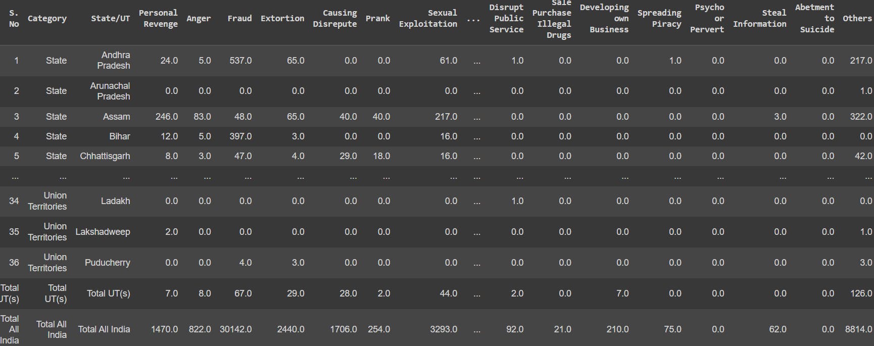
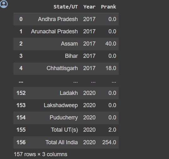
Now we need to introduce to the dataset "cyber crime(2017-2020).csv". We need to implement Pandas to load and display the dataset.
security=pd.read_csv('cyber crime(2017-2020).csv')
security
Step 3
Overview of various Pandas functions :
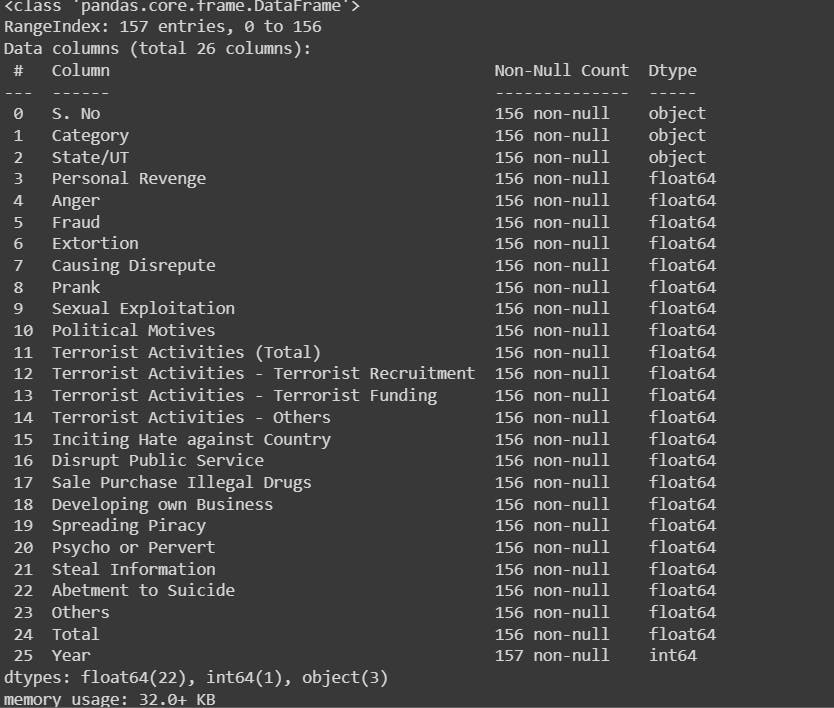
info(): It gives us a precise summary of our chosen dataset.
security.info()
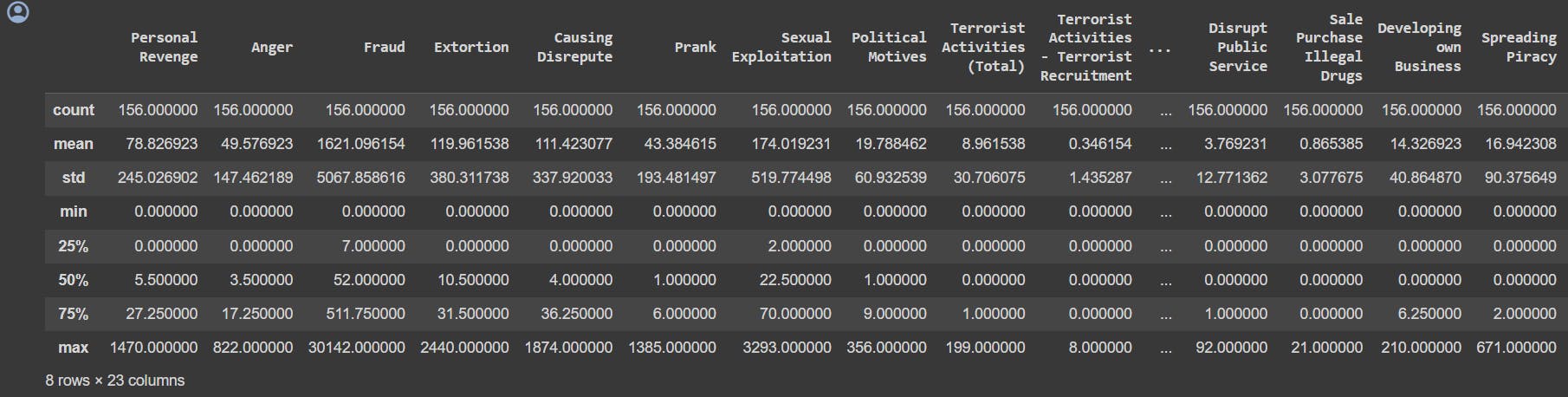
describe(): It provides a summary of descriptive statistics for a DataFrame.
security.describe()
head(): It display the first few rows of the dataset. By default it displays first 5 rows.
security.head()

columns: It displays the number of columns in the dataset along with the column headings.
security.columns

Now, we are done with the basics. Let's analyze the crimes year wise. Here crimes in 2017 are showed. We can analyze the respective years with the same line of code just by changing the year.
evergreen=security[security['Year']==2017]
evergreen

Let's see when Prank goes wrong, and start our analysis picking each column, ("state/ut", "year", type of crimes).
evergreen1=security[['State/UT','Year','Prank ']]
evergreen1
Now we should analyze our data in a sorted order. So we can sort a specific column. Here we have sorted the column : 'Total'.
evergreen=security.sort_values('Total ')
evergreen

Step 4
Overview of various Matplotlib functions :
In this colorful segment, we'll leverage the functionalities of Matplotlib to craft an array of visual representations. Brace yourselves for the enchanting world of bar charts, pie charts, histograms, line charts, and scatter plots. Through these dynamic and animated depictions, we aim to unravel the intricacies of our data in a comprehensive and visually engaging manner. Let the exploration begin!
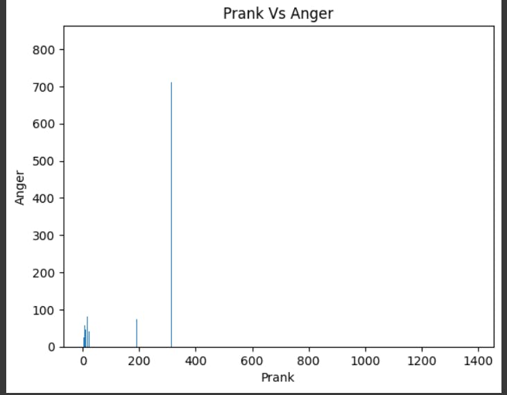
We begin with the bar chart, plotting Prank Vs Anger rate of crimes.
# Create graphs

# create a bar chart of the number of cyber crimes per state

plt.bar(security['Prank '], security['Anger '])
plt.xlabel('Prank')
plt.ylabel('Anger')
plt.title('Prank Vs Anger')
plt.show() #to display the graph
Here also we are plotting against Year vs Total, displaying the grids. In the below code one can find certain new attributes like:
lw=line width
ls= line style which is mentioned as dotted
c= color of the line (g=green & r= red)
# create a line chart of the number of cyber crimes over time

plt.plot(security['Year'], security['Total '],lw=5,c='g')
plt.grid(c='r',lw=0.5,ls='dotted')
plt.xlabel('Year')
plt.ylabel('Number of Cyber Crimes')
plt.title('Number of Cyber Crimes Over Time')
plt.show()

Getting a histograms, on the column "Others". The x-axis represent year and the y-axis represent number of crimes.
plt.hist(security['Others '])
plt.xticks([1000,2000,3000,4000,5000,6000,7000,8000])
plt.xlabel('Year')
plt.title('Others')
plt.show()

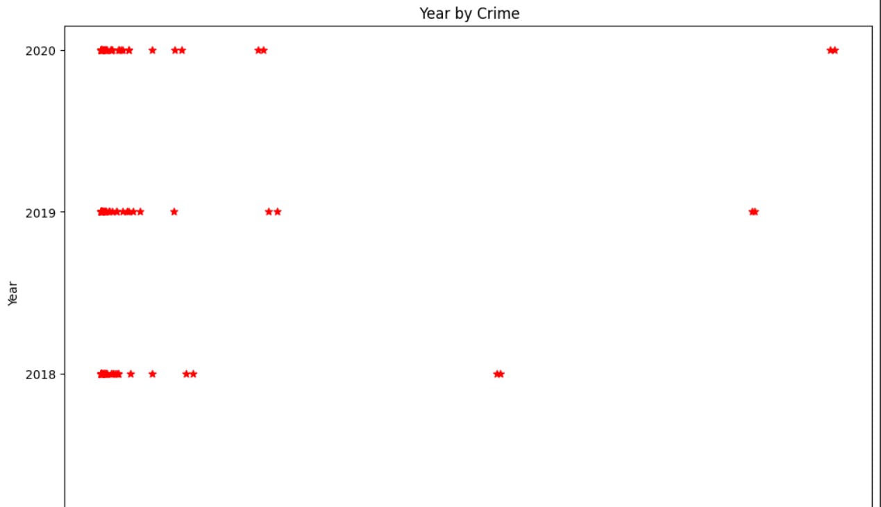
Time for a scatter plot.
figsize() : states the size of the graph
marker : the symbol with which the graph will be plotted
fig = plt.figure(figsize=(12, 8))
plt.scatter(security["Total "], security["Year"], marker="*",color="red")
plt.yticks([2017,2018,2019,2020])
plt.title(" Year by Crime")
plt.xlabel("Crime")
plt.ylabel("Year")
plt.show()
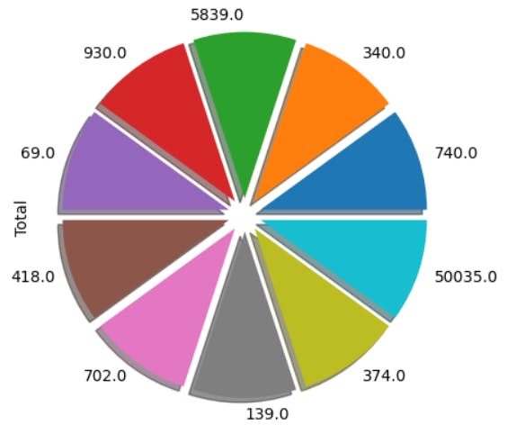
Exploring plot.pie() function to generate a pie chart, but with two attributes, explode
shadow: gives a shadow to our pie chart giving a 3D view.
explode: separates the respective portion of our generated pie chart.
# pie chart
security['Total '].value_counts().tail(10).plot.pie(shadow=True,explode=[0.1,0.1,0.1,0.1,0.1,0.1,0.1,0.1,0.1,0.1])
plt.show()
Step 5
Overview of various Seaborn functions :
As mentioned earlier Seaborn is a data visualization library based on Matplotlib, it helps in generating high level statistical graphics. Let's start with, PairGrid()...
The PairGrid() function in Seaborn is a powerful tool for creating a grid of subplots based on pairwise relationships in a dataset.
#Implementing PairGrd() on Prank and Sexual Exploitation in Xaxis
g=sns.PairGrid(security, y_vars=["Year"],x_vars=["Sexual Exploitation", "Prank "],height=5.5,hue="Year",aspect=2)
ax=g.map(plt.scatter,alpha=1)

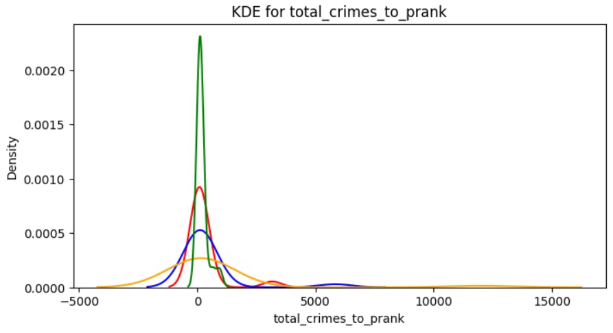
The kdeplot (Kernel Density Estimate plot) in Seaborn is a function used to visualize the distribution of univariate data. It provides a smoothed representation of the data's underlying probability density function.
#Implementing Ratio of total and prank
security['total_crimes_to_prank']=security['Total ']/security['Prank ']
kdeplot('total_crimes_to_prank')
The FacetGrid in Seaborn is a versatile class for creating small multiples of plots based on the values of one or more variables. It allows you to visualize relationships across multiple levels of categorical variables in your dataset.
#Implementing FacetGrid() and map() function
g=sns.FacetGrid(security,col="Category",height=4,aspect=.5)
ax=g.map(sns.barplot,"Year","Anger ",palette="Blues_d")

A box plot (or box-and-whisker plot) in Seaborn is a useful visualization for summarizing the distribution of a continuous variable. It provides a visual representation of key statistical measures such as the median, quartiles, and potential outliers.
#Implementing Box kind or box function
ax = sns.catplot(y="Total ", x="Year", hue="Category", kind="box", data=security, height=5, aspect=1.8)

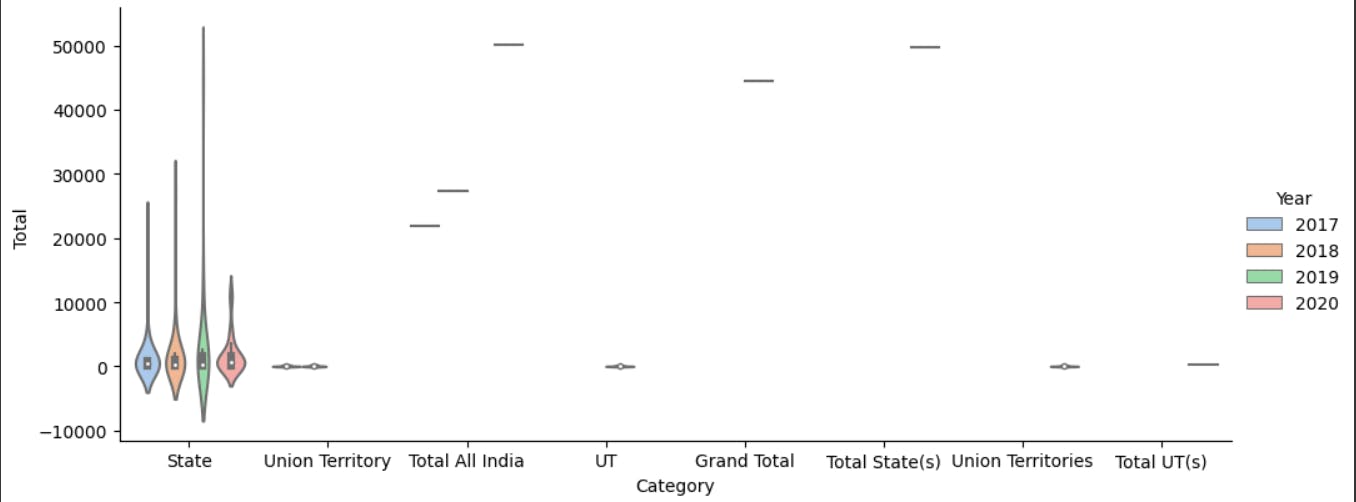
A violin plot in Seaborn is a data visualization that combines aspects of a box plot and a kernel density plot. It is used to visualize the distribution of a continuous variable within different categories or groups.
#Implementing Violin plot
ax=sns.catplot(x="Category",y="Total ",hue="Year",kind="violin",
               palette="pastel",data=security,height=4.2,aspect=2.4)
A heatmap in Seaborn is a graphical representation of a matrix where individual values are represented as colors. It is particularly useful for visualizing the relationships between two categorical variables or displaying the correlation matrix of a dataset.
#Implementing heatmap()
plt.figure(figsize=(12, 6))
security.drop(['Personal Revenge', 'Anger ', 'Fraud ', 'Others '],
        axis=1, inplace=True)
corr = security.apply(lambda x: pd.factorize(x)[0]).corr()
ax = sns.heatmap(corr, xticklabels=corr.columns, yticklabels=corr.columns,
                 linewidths=.2, cmap="YlGnBu")

A joint plot in Seaborn is a combination of multiple plots to represent the relationship between two numerical variables, as well as the univariate distributions of each variable. It can include scatter plots, histograms, kernel density estimates, and regression fits.
#Implementing jointplot()
sns.jointplot(data=security, x="Total ", y="Year", hue="Category")

Step 6
Overview of various Numpy functions :
Finally we have arrived in our last section of our blog :) . Now let's do a quick overview of the functions of Numpy libraries.
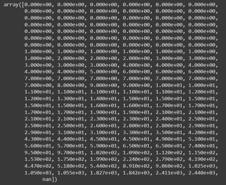
.array() : It converts a set of data into array format.
#converting the dataset into an array
data_array=np.array(security)
data_array

.max() : To display the maximum number from the mentioned group.
#finding the maximum value in a column
col_array=np.array(security['Total '] , dtype=int)
max_value=np.max(col_array)
max_value

.sort() : It helps to sort the data items in ascending order.
#sorting a column
col_array=np.array(security['Extortion '] )
sorted_array=np.sort(col_array)
sorted_array
.mean() : Calculates the mean value of the mentioned data items.
#calculating the mean of a column
col_array=np.array(security['Total '] , dtype=int)
mean_value=np.mean(col_array , dtype=int)
mean_value

.median() : Calculates the median value of the mentioned data items.
#finding the median of a particular column
col_array=np.array(security['Abetment to Suicide'] , dtype=int)
median_value=np.median(col_array)
median_value

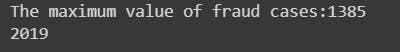
Calculating the which year had the maximum number of fraud cases and what was the highest number.
#finding which year had the maximum number of fraud cases
col_array=np.array(security['Prank '] , dtype=int)
max_index=np.argmax(security['Prank '])
max_value=np.max(col_array)
print(f"The maximum value of fraud cases:{max_value}")
col_array1=np.array(security['Year'] , dtype=int)
col_array1[max_index]
Final Step
We've reached the conclusion of the blog, and I want to express my sincere gratitude for your dedicated readership.
"The Matrix is telling me that I define my own purpose." - Morpheus, The Matrix
This project wasn't just about technical learning; it ignited a spark within me, awakening a deep fascination with the world of machine learning. Driven by this newfound passion, I'm determined to delve deeper, to dissect and analyze diverse datasets, pushing the boundaries of what's possible.
My recent acceptance into the prestigious Microsoft LSA program further fuels my ambition, which will also give me a chance to prove my leadership skills.
In essence, this project wasn't just a stepping stone; it was a launchpad. It propelled me into a universe of endless possibilities, leaving me with an indelible mark – the exhilarating thrill of discovery, the unwavering thirst for knowledge, and the unshakeable belief that I, like Morpheus or Neo, can define my own purpose in this ever-evolving digital landscape.
Embarking on a project in Python was initially a daunting prospect for me as a newcomer. However, this journey not only familiarized me with the fundamentals but also provided hands-on experience in data visualization. I must acknowledge the collaborative spirit of my team members-Rohan Ghosh, Pushkar Pan, Anushri Roy and Shruti Paral. Their invaluable contributions played a pivotal role in the success of this project. Thank You all for being part of this enriching experience.
For any queries or any collaboration work, feel free to contact me on : adhikarypoorvaraja@gmail.com